ATIS report on framework to display verified caller ID
ATIS has published a technical report on a framework for the display of verified caller ID. This report addresses the question “How should we tell a subscriber that caller ID has been verified, or that the caller ID is fake?” Specifically, what should be displayed on the subscriber’s telephone after STIR/SHAKEN processing? This blog post summarizes usability testing and framework proposals described in the report.
STIR/SHAKEN: a solution to the problem of unwanted robocalls

STIR/SHAKEN is a framework to be used by carriers to authenticate and sign caller ID on calls sent and verify the signature on calls received. The process is like processes that have been used with secure internet and secure email for years. This would help consumers by identifying fake caller ID, a tactic used to trick people into answering unwanted robocalls.
Robocalls are annoying subscribers, flooding carrier networks with traffic and driving down call completion rates. They’re also commonly used to perpetrate consumer fraud.
By authenticating and verifying caller ID, consumers could begin to trust caller ID and answer more calls. Depending on the level of participation, this could mean game-over for robocallers. Fewer people would answer robocalls. Carriers would see higher call completion rates.
An important piece of this solution is to define what information should be presented to subscribers to give them confidence to answer calls. There have been vague proposals about maybe showing a green check for good calls and some sort of warning for fake caller IDs. This report, ATIS-1000081, gets down to specifics.
Usability studies
ATIS didn’t formulate proposals in a vacuum. They drew on several usability studies conducted by other organizations.
Usability study 1: Certified call markers
In this study, Hiya, a company that offers a reputation service to prevent unwanted robocalls, performed usability tests with volunteers to measure the effect of presenting some sort of certification information for a phone call.
The results showed that the presence of some sort of certification marker in caller ID gave the subjects more confidence in the legitimacy of the call.
Furthermore, once they started seeing calls with a certification marker, they became more doubtful of the legitimacy of calls that did not have the marker. Some subjects expressly stated that they would be less likely to answer any call that didn’t have the certification marker.
Usability study 2: Call pickup rate
Hiya selected a test pool of numbers including several business customers. For two weeks, Hiya placed a white checkmark next to calls from users they knew were legitimate. Then they stopped placing the checkmark on any calls for two weeks. They noticed a 5% higher pickup rate from customers who saw the checkmark.
Usability study 3: Warning phrases
Hiya tested seven different warning phrases on a group of 400 subjects and asked whether they would pick up the call, block it, and whether they trusted the legitimacy of the call. Here are the results:
| Display | Pickup rate | Block rate | User trust |
|---|---|---|---|
| Phone number only | 30% | 29% | 46% |
| Private Number | 28% | 43% | 38% |
| Fake Phone Number | 21% | 49% | 30% |
| Possible Fraud | 11% | 57% | 20% |
| Unknown Caller | 24% | 33% | 42% |
| Caller Not Verified | 24% | 39% | 40% |
| Spoofed Number | 19% | 51% | 29% |
“Phone number only” was included in the test as a baseline to compare it to current behavior, not as a proposed option.
Notable findings:
- Possible Fraud had a dramatic impact on pickup rate, block rate and trust.
- Fake Phone Number and Spoofed Number had essentially identical results—less severe than Possible Fraud but stronger than the rest.
- Unknown Caller and Caller Not Verified were innocuous phrases that had less impact—getting closer to “Phone number only.”
- Private Number had little impact and was essential identical to “Phone number only.”
Usability study 4: Icon test
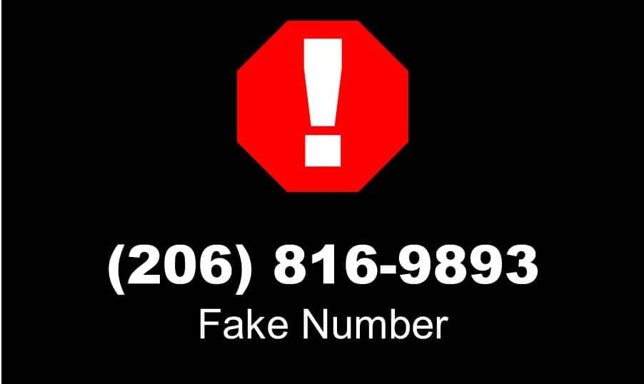
This study paired icons with phrases such as “Possible Fraud” and “Fake Number” to see if the icons changed subject behavior. Icons included a stop sign, warning sign and an unknown person sign.
Here are the results:
| Display | Pickup rate | Block rate | User trust |
|---|---|---|---|
| Possible Fraud (no icon) | 11% | 57% | 20% |
| Fake Number (no icon) | 21% | 49% | 30% |
| Possible Fraud + stop sign | 9% | 58% | 18% |
| Fake Number + stop sign | 17% | 51% | 25% |
| Possible Fraud + warning sign | 10% | 60% | 21% |
| Fake Number + warning sign | 17% | 54% | 25% |
| Possible Fraud + unknown sign | 13% | 62% | 20% |
| Fake Number + unknown sign | 18% | 50% | 30% |
These findings were a bit surprising. While the icons had a measurable effect on subject response, they didn’t make a big difference. The stop sign made the biggest difference, and the unknown sign the least. The text messages seemed more important than the icon that went with it.
ATIS proposals
Based on these findings, the report makes the following suggestions:
- Full attestation and validation passed: Present the logo and location (city and state) of the caller is retrieved and delivered by enhanced CNAM (eCNAM). Do not include any icons, such as green check marks, or text affirmations of successful validation.
- Gateway attestation only and subsequent analytics service flags the caller as a known scammer: A “Suspected Scam” message. If the device supports it, include a stop sign icon.
- Validation fails: Present a “Fake ID” message. If the device supports it, include a stop sign icon. Alternatively, the carrier may block the call for subscribers who request that.
Other considerations
The report concludes with a few other recommendations:
- Display should not rely on colors, which would not be effective with people with color blindness.
- Messages should use clear language. For example, some people might not be familiar with the term “spoof.”
TransNexus STIR/SHAKEN support
We have developed STIR/SHAKEN functionality in our ClearIP and NexOSS software products.
Contact us today to learn how we can help you get ready for SHAKEN quickly.
